LILU
Identity and app for a location-first dating product built around travellers: find your perfect vacationship.
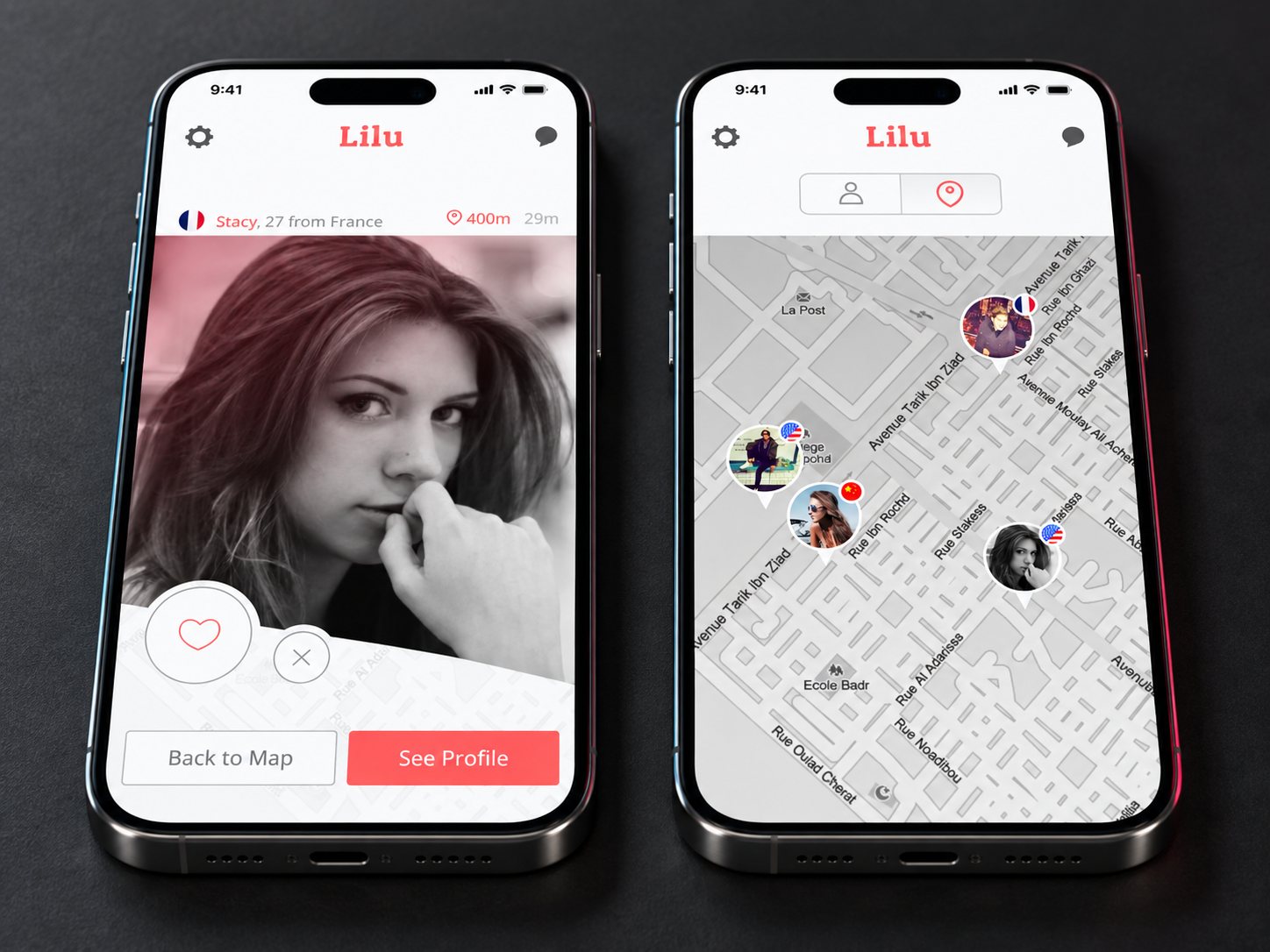
Lilu starts from the map, not the deck of cards. You open it in a city you do not live in and see who else is nearby right now, with distance and how long ago they were there, so the product is about proximity in time as much as place.
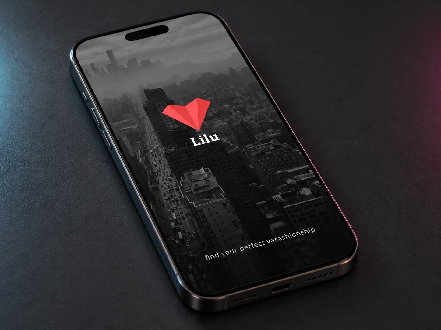
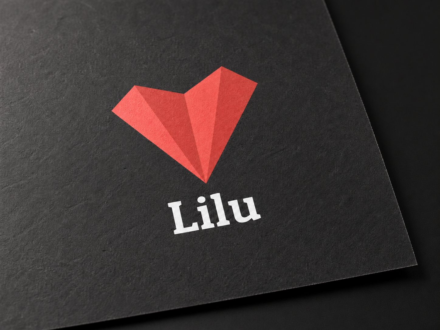
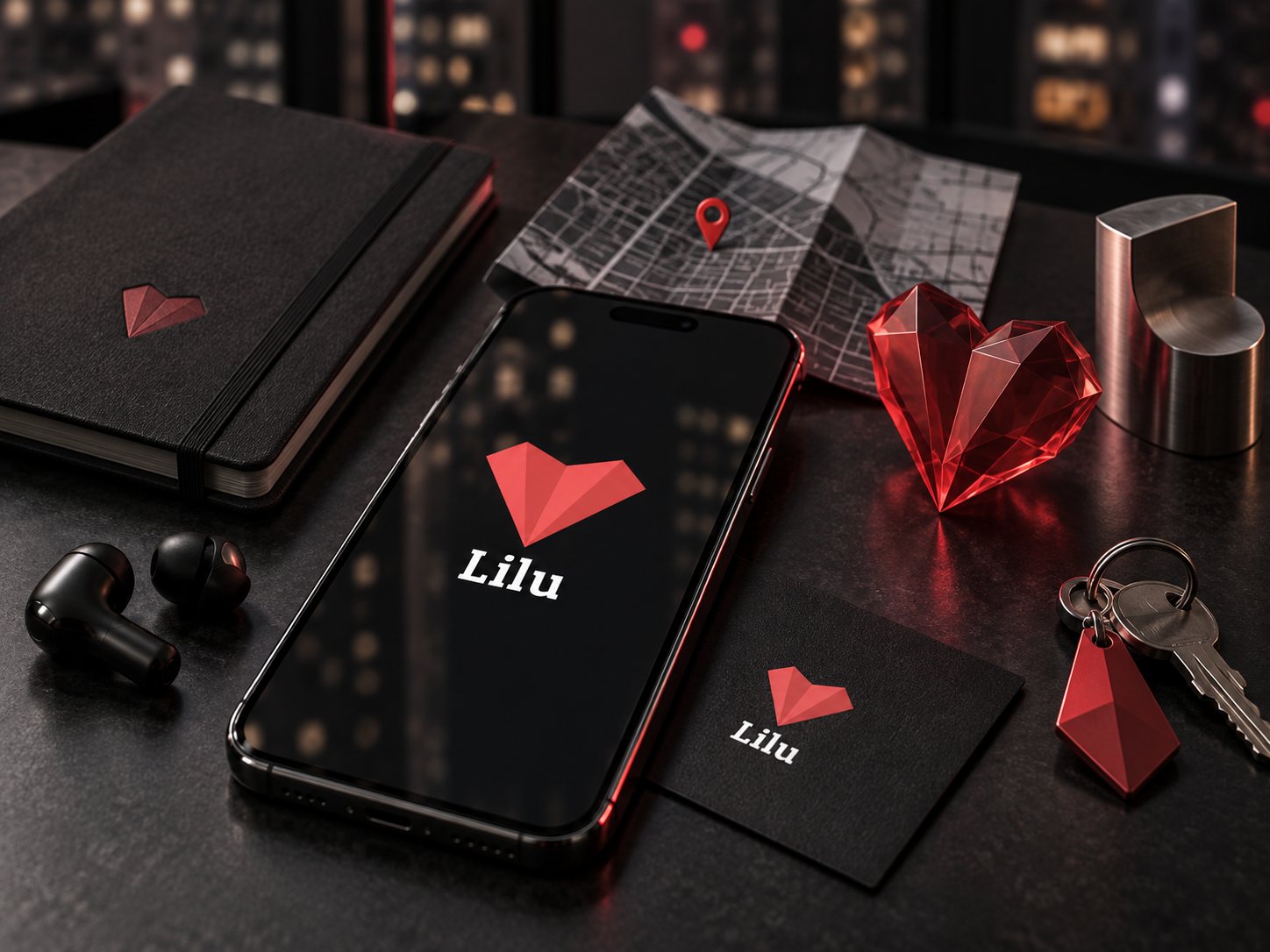
The mark folds a paper plane and a heart into one shape: travel and attraction in a single low-poly form that reads at favicon size and holds up as a 3D object in campaign renders. Coral red on near-black, with a slab serif wordmark to keep it from looking like every other dating app.
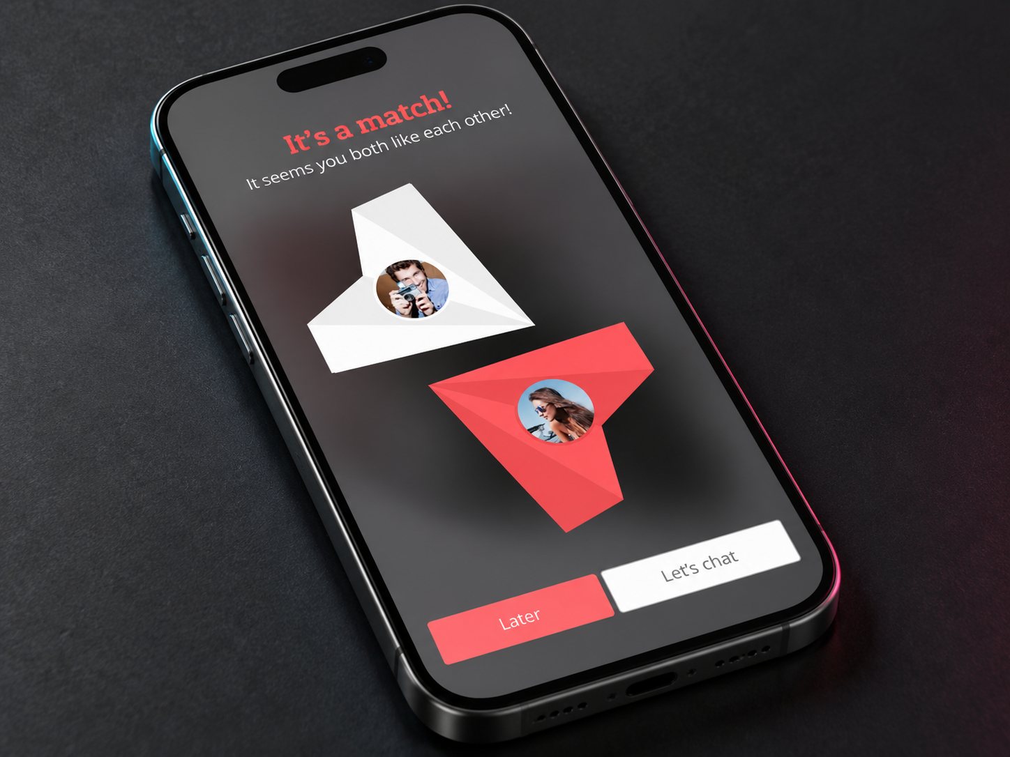
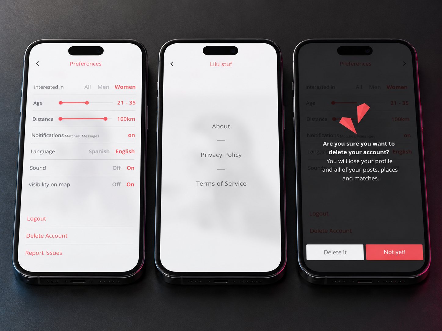
The app itself stays light and plain so the photography carries the mood: a profile card over the map, a like and a pass, a match screen where the two planes meet, and settings that keep the difficult choices - visibility on map, delete account - unhidden and calmly worded.
Outcome
Delivered as a full product package: mark, app UI and the brand applied across the kit.